The next tab on the XLights software is the Layout tab. This is where you create the actual “simulation” for your house.
When you select the layout tab, you’ll see a section on models on the top left, some details on the bottom left, and a sketch of our display layout on the right.
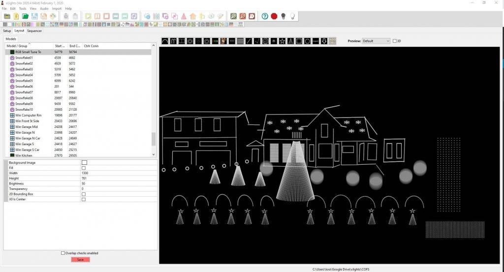
In order to see the photo I used to draw this picture, select the “Background image” box on the lower left, and then add the “House 2017.jpg” in the COFS folder. It should now look like the below picture.
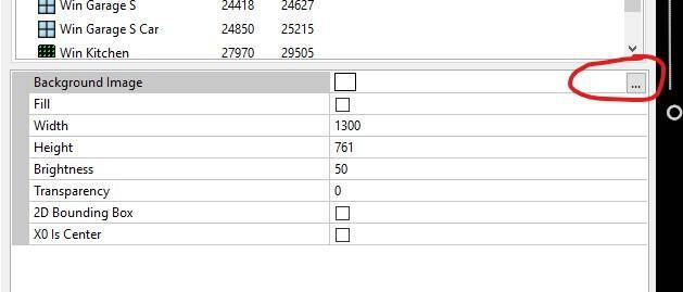
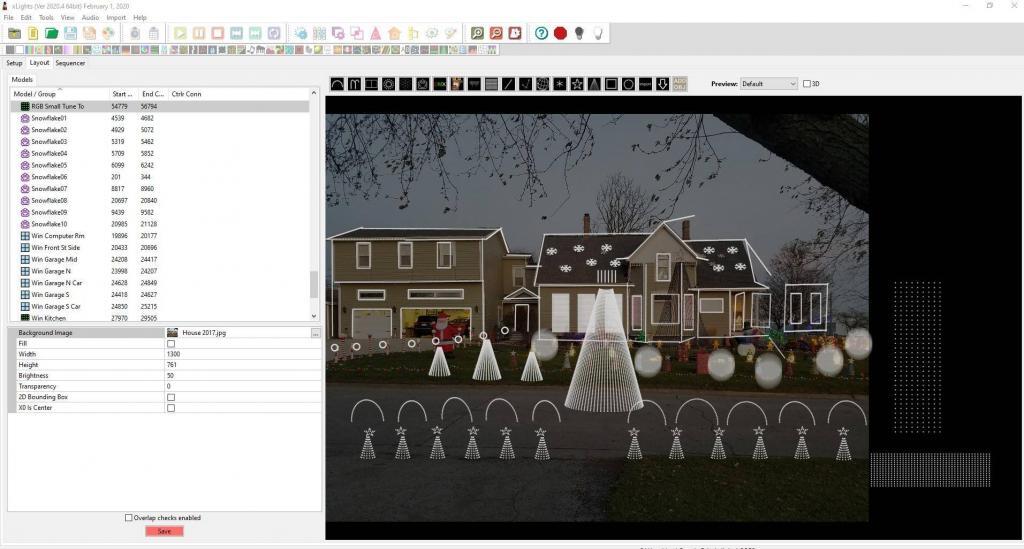
I generally used the picture to draw the elements (lines, trees, etc.). This helped to make sure that my picture was more accurate from a size perspective. Once I’m done drawing all of my elements, I usually would change the brightness to 0% (since it was easier to see the lights without the picture).
You’ll notice things aren’t “exactly” where they are on the picture – sometimes you want to design things straighter than the picture looks. On the right side of this picture, you’ll also notice I drew in parts of the house you couldn’t see from this photo. I see that XLights now has a 3D option, but I had not used that.
As a side note, I had tried a more angled (isometric) view of our house, but I actually found it to not work as well. Straight lines are going to show up best – if you’re making a color move from left and right you want horizontal and vertical lines. But that’s just my experience.
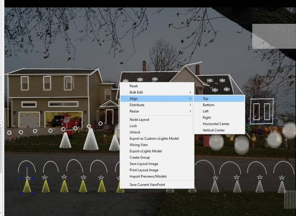
There are other tricks in “drawing” items on here – what’s the beginning of the string vs the end was a big one (especially when your string lights up opposite of what you expect!). There’s also some neat features on alignment, moving multiple elements together, etc. Check out the XLights wiki for more details, or ask on the forums.
You can click on an “element” on this tab to get more information about it. For this example, I picked my 1st mini tree (far left).
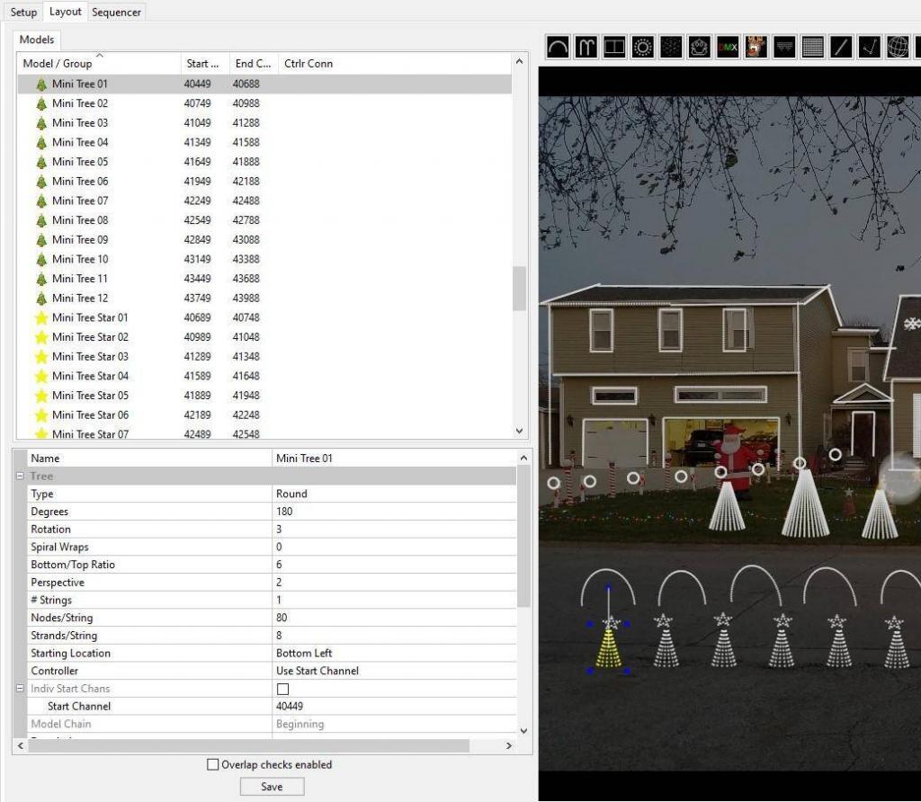
In this section, you can tell that I selected a “round” tree as the type of element, it’s only 180 degrees (versus an entire tree of 360 degrees), It says I’m using 1 string with 80 nodes (or pixels) on it, and 8 strands per string. The strings start o nthe bottom left, and the beginning channel is 40449. There’s a ton more information, but this type of information is needed to make sure the program matches how you built your element. For example, all of my trees start on the bottom left and are strung up and down from there. Most of my string start from left to right, but there are times when it makes sense for a string to start on the right (depending on where the light string connects up to one of the Falcon F16 boards).
Don’t worry, that’s a lot to digest. But you’ll get there. For now it’s good enough to draw a few elements and see what the software does. You can always re-model an element in this view to match how you build something.
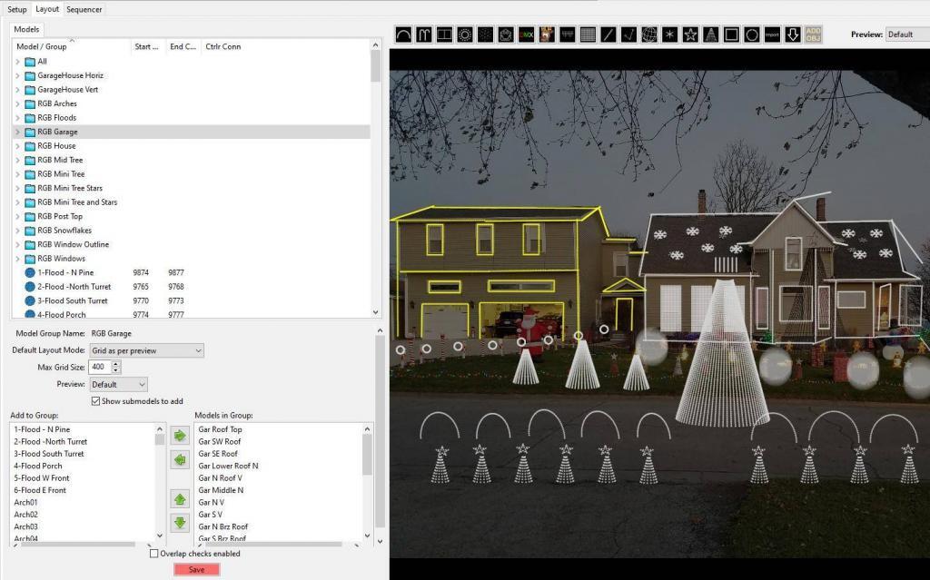
Another very helpful feature is the ability to create groups within your display. For example one of the groups I have is my “RGB Garage”. This contains all of the lights on my garage. You’ll see me use this quite a bit during certain songs, such as the Jingle Bells Dueling Banjos, when my house and garage are dueling one another.
When you’re done making changes, *make sure* to click the save button at the bottom.
As I mentioned before, this should give you a quick idea of what this tool can do, but there are so many more features you can delve into. Make sure to heavily use the XLights Resources Page
One word, before proceeding. Keeping a Wiki up-to-date is hard. It’s even harder when features are being added and improved weekly. So, please be understanding if the latest version of the software doesn’t match the pictures in the wiki or on the videos. Better yet, when you become an expert at this software, volunteer some time to help keep these tutorials up to date!
Next stop, the Sequencer Tab!
Leave a Reply
You must be logged in to post a comment.